Wordmark & Logomark
Mellon’s wordmark and logomark are fundamental pieces of our visual identity—icons that remind, connect, and reaffirm.
Range of Expression
-

Pristine
-

Empowering
-

Dynamic
-

Reverential
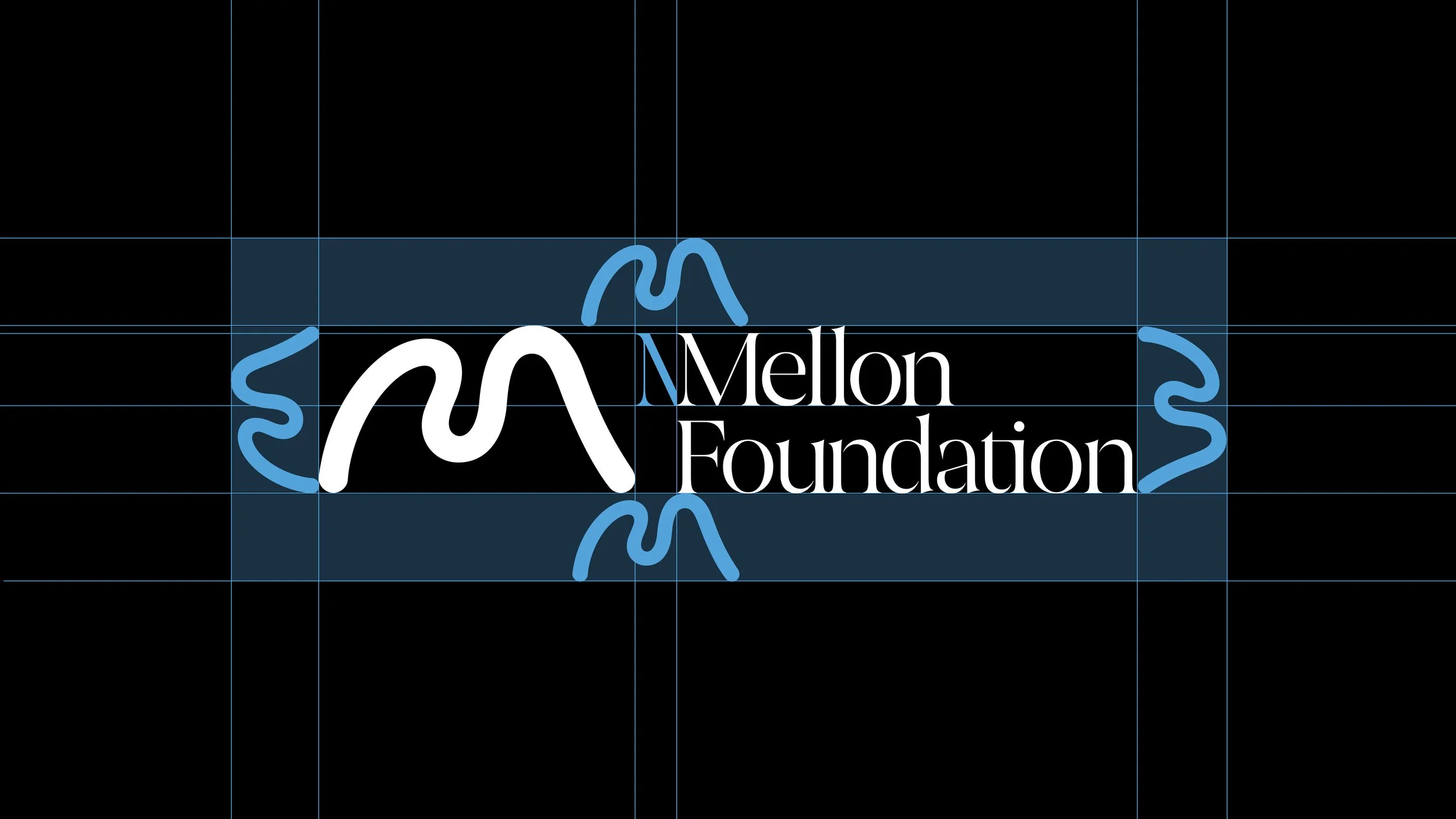
Logomark Clearspace
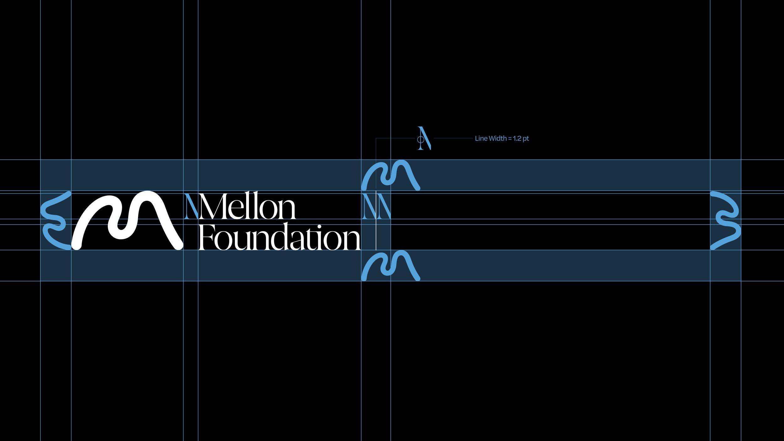
This example demonstrates the logomark scaled to match the height of the logomark to define the minimum safety area. This area must not be imposed upon by other graphics.
Wordmark Clearspace
This example demonstrates the extracted M from the wordmark to define the minimum safety area. This area must not be imposed upon by other graphics.
Logomark and
Wordmark Clearspace
This example demonstrates the logomark scaled to match the height of the logomark to define the minimum safety area. This area must not be imposed upon by other graphics.
Primary Logomark Lock-Up
Mellon’s primary logomark is bold yet pristine—paired with typography that speaks and holds the presence of poetry.
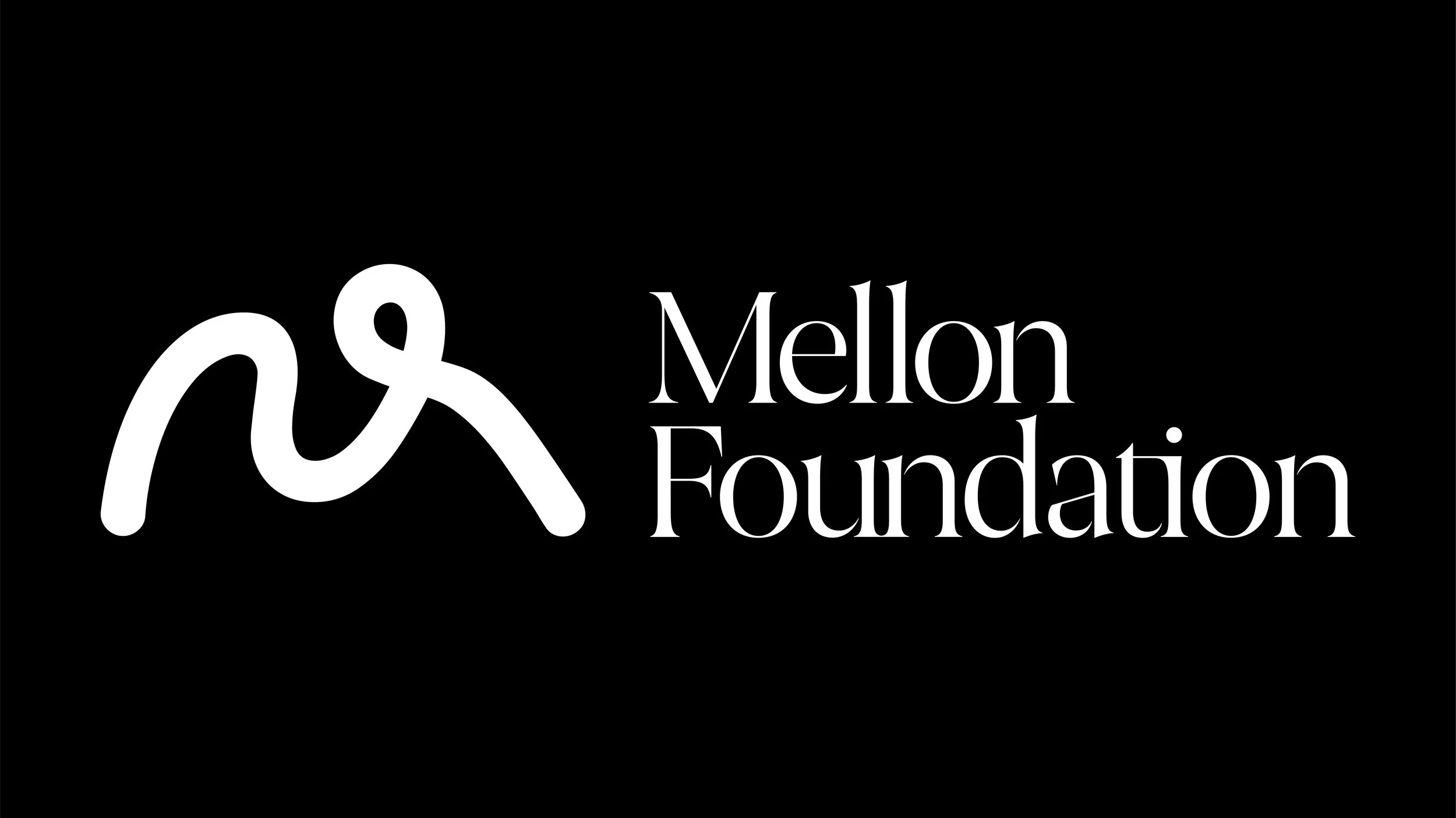
Alternative Logomark Lock-Ups
The logomark may be replaced with a variant by adjusting the M in the Alternative Logomark file.
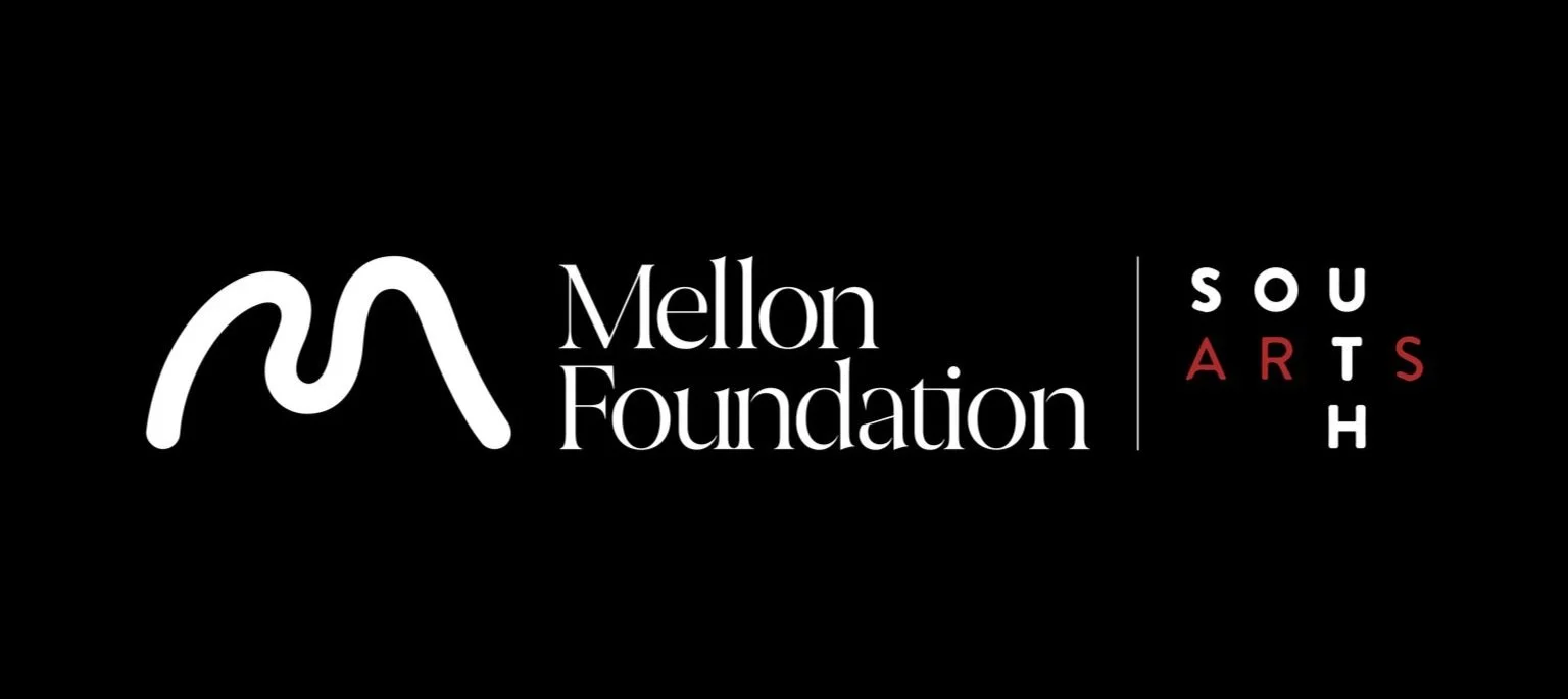
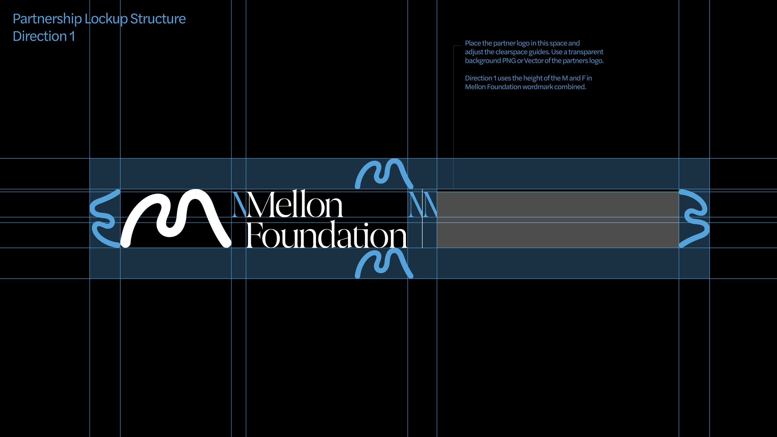
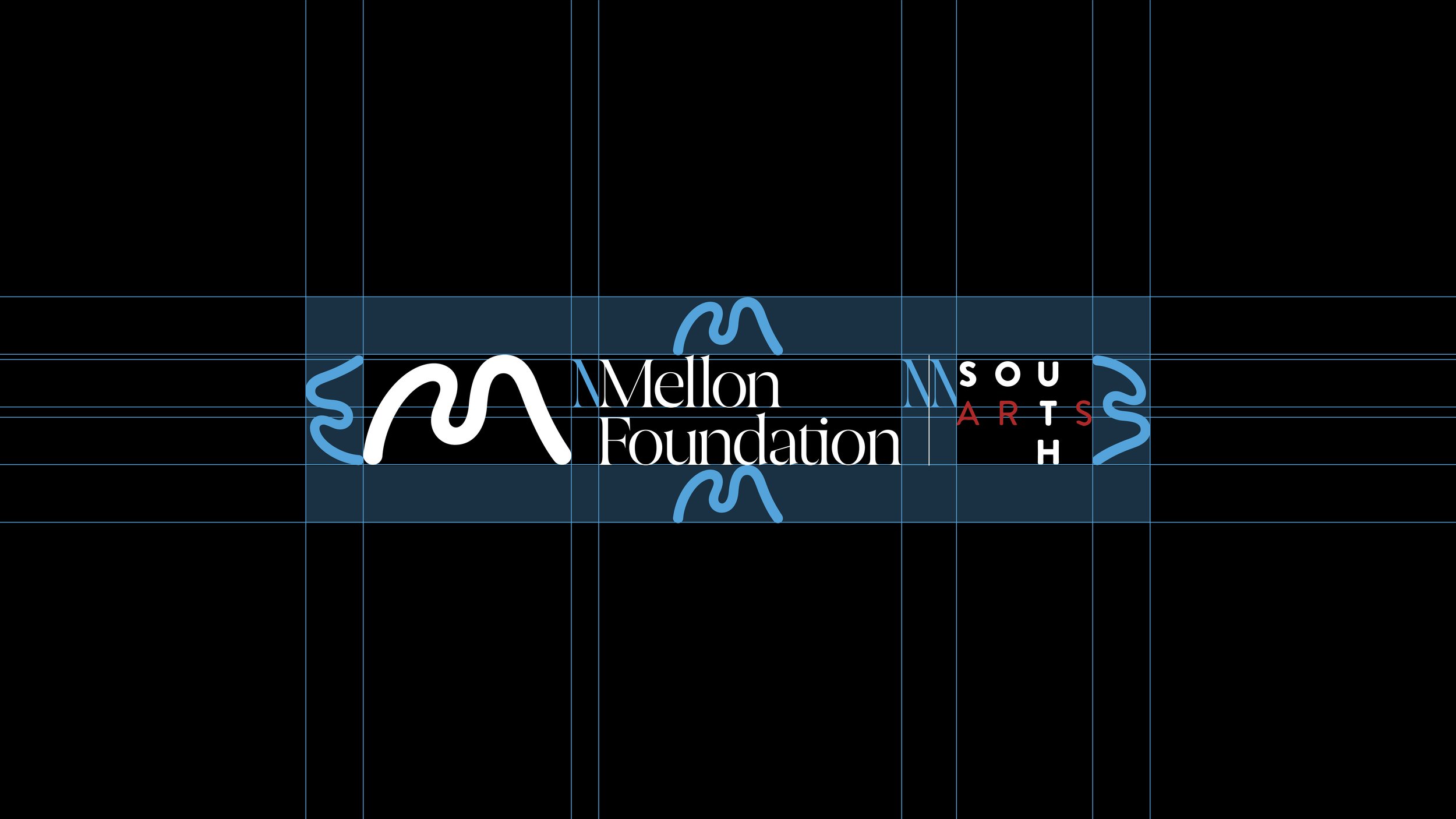
Partnership Lock-Ups
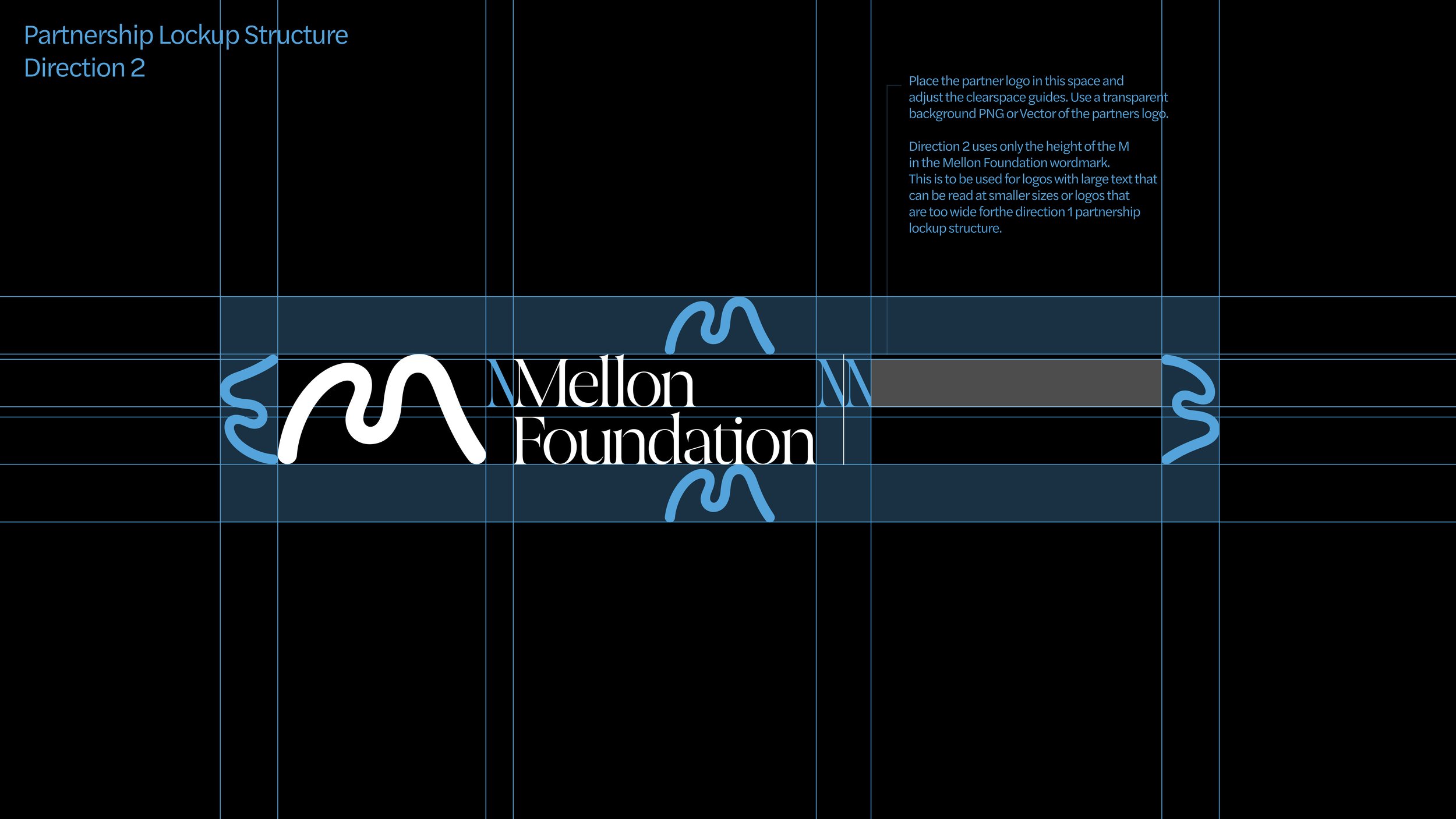
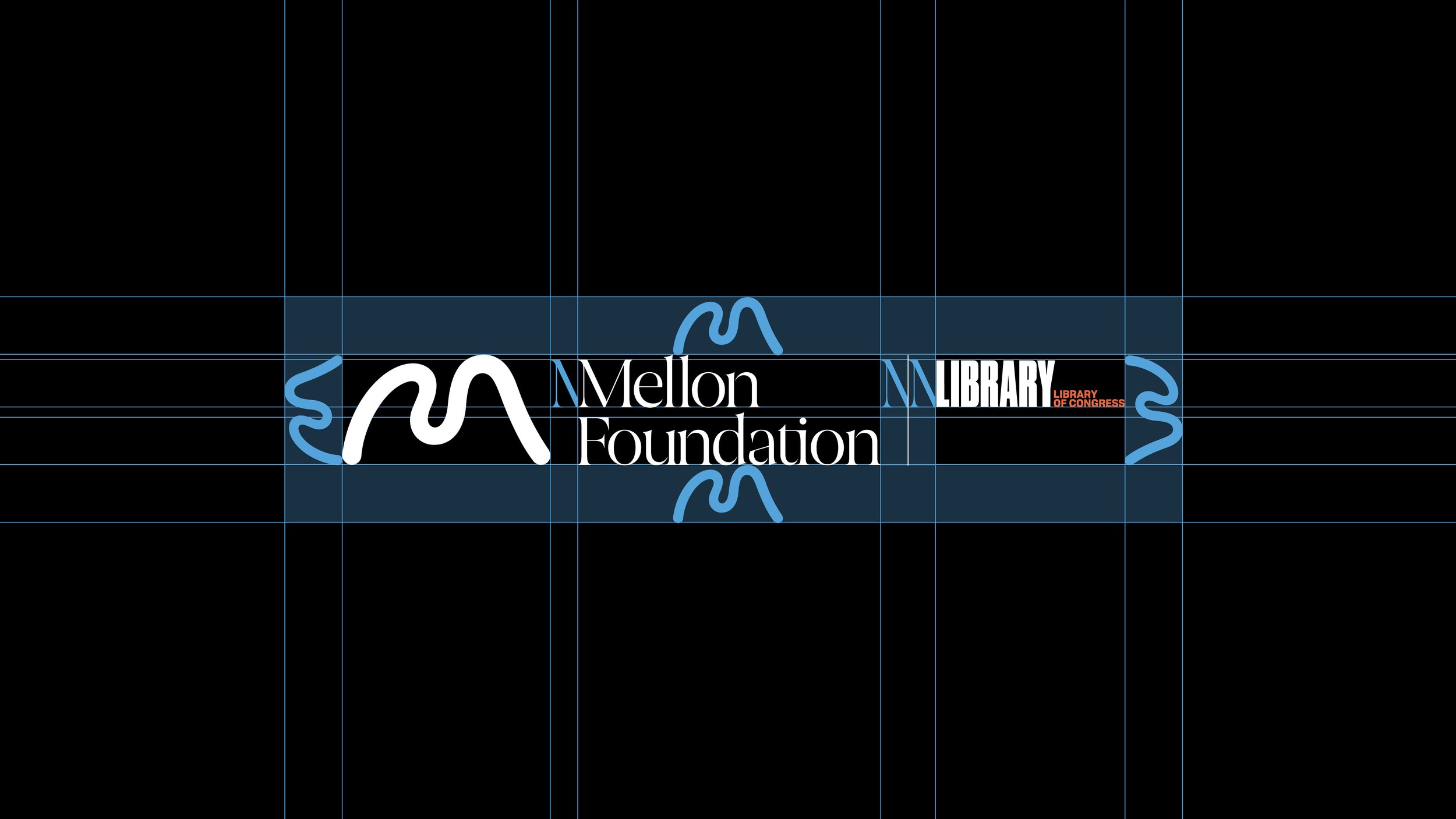
There are two directions to choose from when creating a partnership lock-up structure. Direction 1 uses the height of both the M and F combined in the Mellon Foundation wordmark. Direction 2 uses only the height of the M in Mellon.
Separating the
Logomark & Wordmark
The logomark and wordmark can be separated only when adjacent to one another and using the same lock-up and clearspace structures as the primary logomark.
Formal Usage Lock-Up
The formal usage lock-up should be used only for legal matters—for example, special letterhead for a legal document. This lock-up should never be used in other circumstances that don’t require our legal name to be used.
Intertwined Lock-Up
This lock-up follows our Weaving visual system, which uses the M to weave in and out of type, layers, or imagery to create a dimensional effect. This lock-up shouldn’t be used for formal purposes.
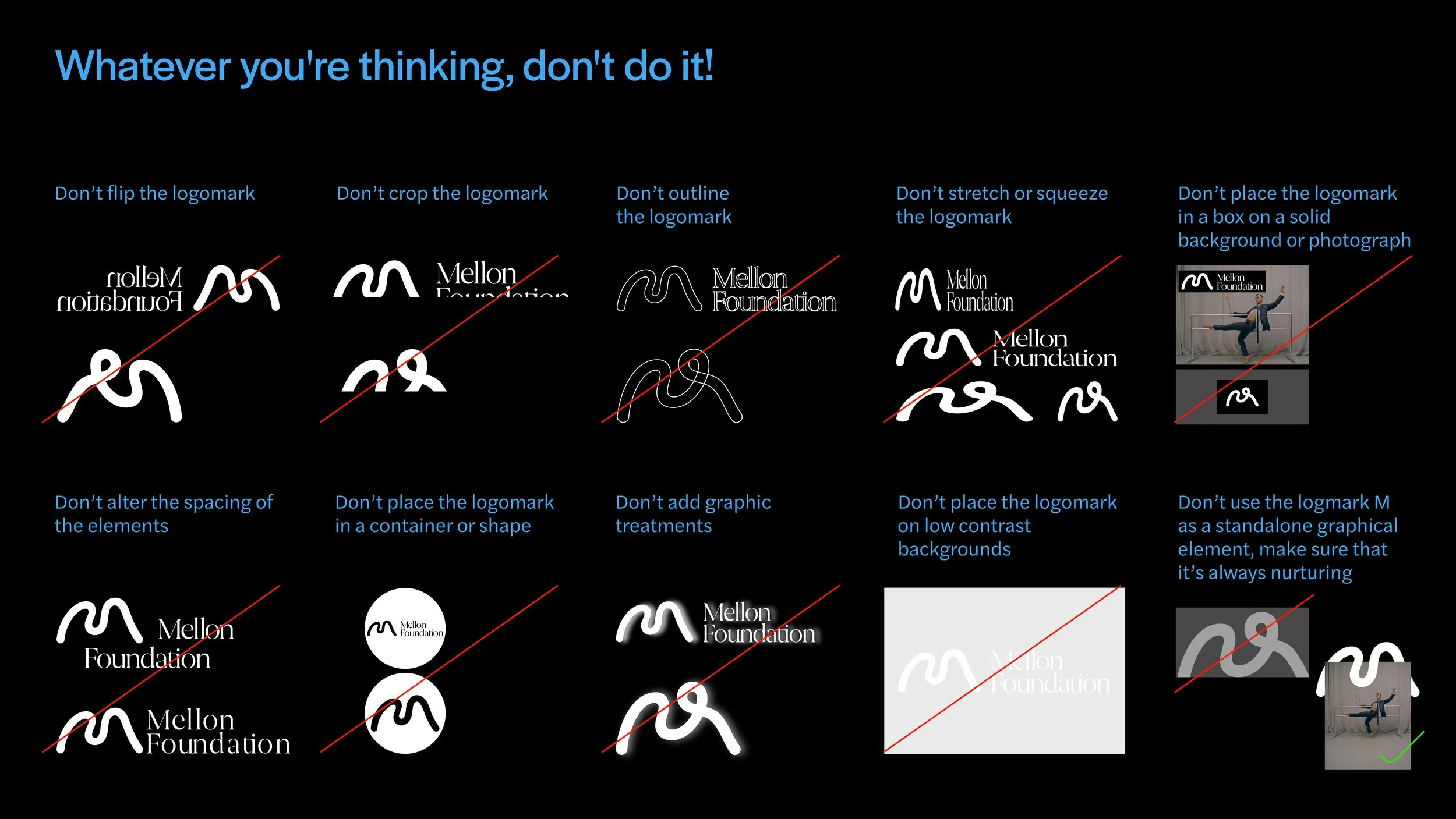
Logomark Don’ts
Below are examples of things to avoid when using Mellon’s logomarks. Ensure that you are always referring to the Visual System section and existing examples of logomark usage. Stick to what has been specified in the guidelines.
Animated Logomarks
Animated logomarks bring our identity to life. They show how both the sonic and visual identity unify, as well as how the logomark can embody different colors and material to adapt to its requirements.


